The colours you choose for your advertisement are more essential than the ad’s actual content. The reason for this is that the colours (and pictures) attract the attention of the consumer, causing them to read your advertisement. According to the website verywellmind.com, “Color impression, according to psychologists, can account for 60% of the acceptance or rejection of a product or service.”
To many cultures, each colour has a particular meaning. It’s critical to create your commercials in a way that appeals to your target demographic when it comes to advertising. Make an effort to select colours that complement the message you’re giving to your customers.
Red
Action, warmth, power, aggression, excitement, drama, fire, blood, passion, love, danger, rage, and heat are all associated with the colour red. It’s a bright, eye-catching colour that will always draw attention. Red will also elicit a range of feelings.
Stop signs have taught us to come to a complete stop when we see red. So it’s only logical that you’d want to pull over and take a look at a bright red billboard.
People at casinos wager more in red rooms than in any other colour, according to studies. Automobile dealerships, pet stores, pasta shops, pizzerias, and restaurants all benefit from the use of red.
The colour red, on the other hand, is not suggested for medical firms because it denotes ill health, blood, and emergency. Accountants use the colour red to signal that they have a negative cash flow.
Orange
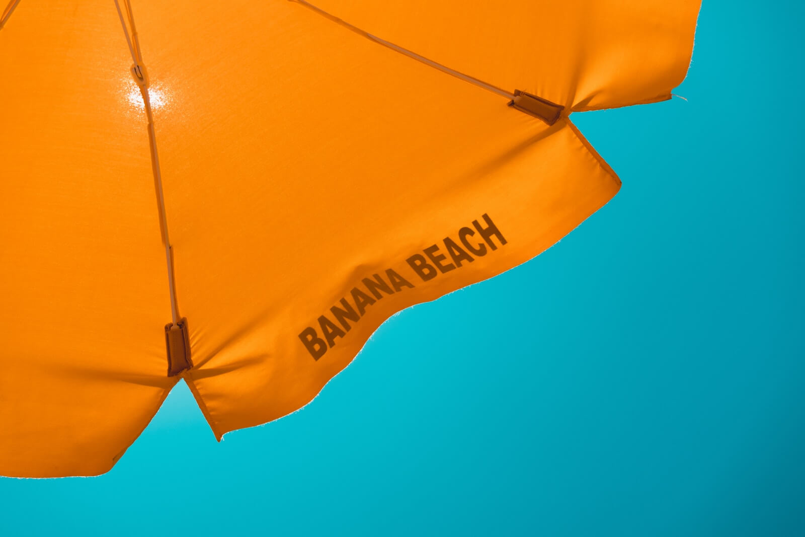
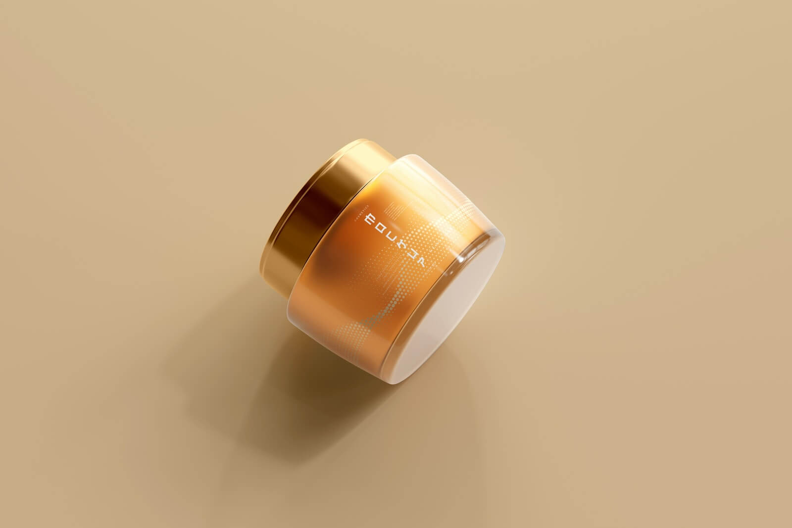
Orange is a lively and enjoyable colour. It enhances mental clarity and generates feelings of warmth and contentment. Orange also improves the flow of oxygen to the brain. Orange is also related to feelings of contentment, fruitfulness, and wholesomeness.
The colour orange can make a high-priced item appear more affordable. It’s the ideal colour for things that appeal to a broad audience.
Orange is a stimulant of the appetite. Vitamin stores, Mexican restaurants, dancing clubs, and products aimed at Latin and French people should use this colour.
Yellow

Yellow is an ideal colour for advertising that is sunny, pleasant, bright, cheerful, lively, energetic, and optimistic. Florists, candy shops, toy stores, amusement parks, and discount retailers will all benefit from this choice.
The eye processes yellow as the first colour. It is also the colour that the human eye sees the most. This is why it attracts the eye more quickly than any other colour.
Yellow is also a cautionary colour. The majority of yellow road signs alert drivers to a problem on the road or in oncoming vehicles. Another reason why yellow attracts our attention is because it is bright.
Green

Life, nature, the environment, youth, money, renewal, hope, and power are all represented by the colour green. It’s a colour that relaxes individuals, relieves discomfort, and gives us a sense of security.
Subscribe for updates
We feel welcomed since green traffic lights have conditioned us to move forward or enter places. This is a fantastic feature to have in any product or service.
Because yellow-green is an appetite suppressant, it is not a good colour for food marketing.
People are soothed by light green. That’s why light green walls can be found in jails, schools, waiting rooms, and hospitals.
Because it denotes money, green is a wonderful colour for financial counsellors, banks, and accountants. It’s also useful for outdoor products because it provides them with a sense of being outside in nature. Because green symbolises life, it can be utilised for greenhouses, vegetable stands, landscaping, and farmers.
Blue
People associate blue with feelings of calm, relaxation, tranquilly, peace, wisdom, loyalty, and trustworthiness. It assists people in accepting themselves and resolving their issues.
The colour blue can also help you work more efficiently.
Blue, on the other side, can also represent sadness and depression. Because most foods are not blue, the colour blue acts as an appetite suppressant and can aid weight loss!
Blue is the most favoured colour among men and women alike. Blue is used in the logos of a number of well-known companies. Travel agencies, pool companies, masseurs, physicians’ offices, pharmacies, medical suppliers, motels, psychologists, and weight reduction facilities all benefit from this colour.
Purple
Purple is a colour that exudes sophistication, creativity, luxury, and richness. It’s also linked to aristocracy. Purple in a bluish tint creates mystery, whereas purple in a reddish shade is sensual and creative. Combining purple with a reddish colour will definitely attract more attention.
Purple can be difficult to see for certain people (often men). Artists, elaborate restaurants, clothes stores, book stores, art galleries, nightclubs, magicians, photographers, country clubs, golf courses, jewellery stores, beauticians, and fortune-tellers will all benefit from this colour.
Brown
Brown is associated with coffee, lumber, and earth tones. It’s a colour that’s dependable, substantial, strong, mature, and comfy. Brown is currently seen as a rich and robust colour.
Hardware stores, coffee shops, craft shops, herbal shops, health food stores, male haberdasheries, cabinet shops, western stores, contractors, clock shops, and carpenters all benefit from the colour brown.
Black
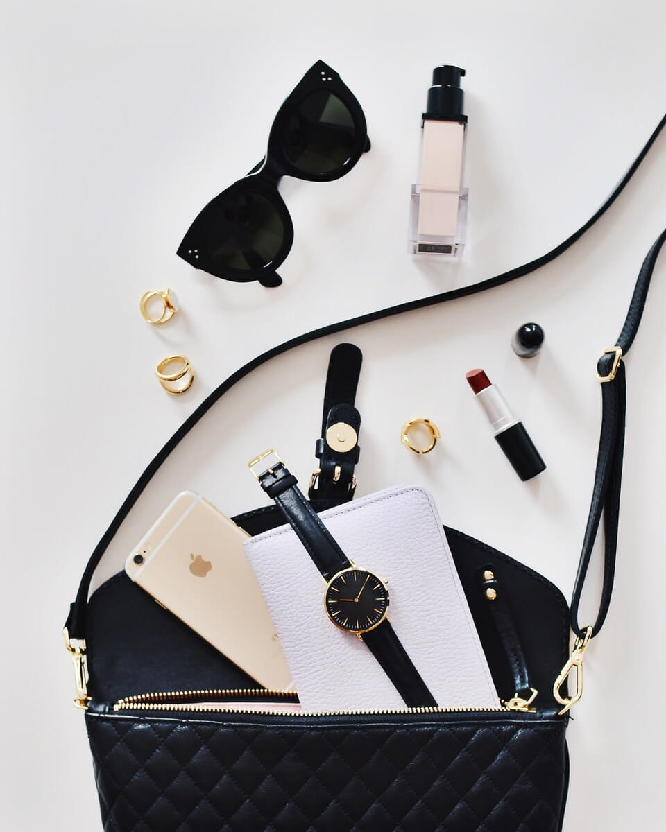
Power, prestige, elegance, style, dependability, simplicity, and sophistication are all represented by the colour black. It’s more about attitude than anything else when it comes to the colour black. Black is a fashionable colour that keeps customers current with technology. Little wonder why almost all the fashion brands use black. It’s also a highly educational colour.
Black was once associated with death, witches, demons, and evil. This perception, however, is changing today.
Music stores, accountants, lawyers, technology stores, and tyre stores all look amazing in black.
White
Purity, cleanliness, virtue, innocence, and freshness are all represented by the colour white.
Bridal shops, weddings, religious groups, daycare centres, medical institutions, wineries, dentists, catering firms, bakeries, museums, historical sites, bed and bath stores, dry cleaners, and cleaning services all benefit from the colour white.
Please be mindful of the fact that white is a colour associated with death and mourning in China, Japan, and other Middle Eastern countries.
Once you’ve decided on the perfect colour (s) for your company, make sure to research which colours work well together.
Does your brand critically need to carry out a compelling advertising campaign? Branditechture is the way to go! Just schedule a callback or get in touch.
