MTN, Africa’s largest telecom operator, is planning a major rebrand on February 27th, which will include a new logo and the replacement of its previous tagline, “Everywhere you go,” with “Y’ello.”
The new logo is already visible outside MTN’s head office address on the N1 Expressway in South Africa.
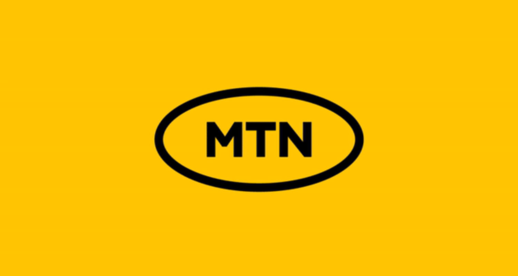
MTN’s signature white, yellow, and red text on a blue oval has been replaced by a streamlined black on yellow logo.
On a yellow background, the block letters, “MTN” is encircled with a black oval outline around them.
Credit: @MTNGroup
“Y’ello” is written in stylized white letters on the same yellow background.
While the rebranding has started outside of MTN’s Johannesburg headquarters, it will be carried out throughout the company’s international outlets in phases.
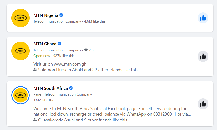
The new logo, however, has been updated on all MTN’s social media platforms, including Facebook.

MTN’s updated display profiles on Facebook
Nompilo Morafo, MTN’s Chief Sustainability and Corporate Affairs Officer, said the new look reflects the business’s transition from a telecommunications giant to a technology company.
Subscribe for updates
The new brand will debut on February 27, according to her gist with TechCentral.co.za. She says the new logo is part of the organization’s “Ambition 2025” strategy, which aims to build “leading digital platforms for Africa’s progress.”
MTN has sought over 150 digital specialists in South Africa as part of its quest to become a full-fledged technology services company. Product designers, performance marketers, digital content producers, E-commerce gurus, full-stack developers, Scrum Masters, and business analysts are all needed.
The goal of this rebranding is to influence the public’s perception of MTN as well as its market worth. Short-form video content (MTN Shortz), music streaming (Music Plus), social media (MTN Ayoba), mobile money (MTN MoMo), voice, and data are among the services it now offers.
Public reactions following MTN’s rebrand

MTN’s new logo
While this may look to MTN like a really nice move, it’s certainly going to need some getting used to. Public opinions show that the new logo doesn’t quite connect well with a huge portion of their fan base.
https://twitter.com/JCAdv_WX/status/873111372145479681
I still can't wrap my head around the new MTN logo to be honest. It feels too lazy rather than minimal.
Black, yellow, oval (horizontal), and then MTN with Montserrat.
Not a fan of it, but it will grow on me, I hope.
— Joshuer (@joshuer_x) February 17, 2022
The Old logo is nice compared to the new one. It looks so simple and looks like KOO nyana yabo🥺 the designer wasn't in mood💔🤦🏾♂️
— GUDABEATS🎛🎚🎹 (@GudaBeats) February 16, 2022
Damn. That MTN logo is trash
— The apparel/watch/perfume plug 🔌 (@Zawadi__) February 17, 2022
Members of Nigeria’s largest Facebook design community, Naija Graphic Designers have varying and contrasting opinions on the revamp, but expectedly, the majority are rooting for the new logo.
What do you think of the new logo? Let us know in the comments below!


