Flutterwave had just unveiled their rebranded look at the “Flutterwave 3.0” virtual event which was held on the 18th February 2022, 5:00 pm.
Flutterwave, which have now reclaimed the top spot as the most valuable African payment startup, also unveiled a range of new products and services, including FinTech as a Service for embedded finance, SME business loans for its users, issuing of debit cards, and the inclusion of Apple Pay and Google Pay to its payment options.

Flutterwave’s Old Logo
The famous Flutterwave logo (shown above) has now been confirmed obsolete after the FinTech company announced to the world that it would be wearing a new look. It may, however, take some time for the new logo to be updated across all their media platforms.
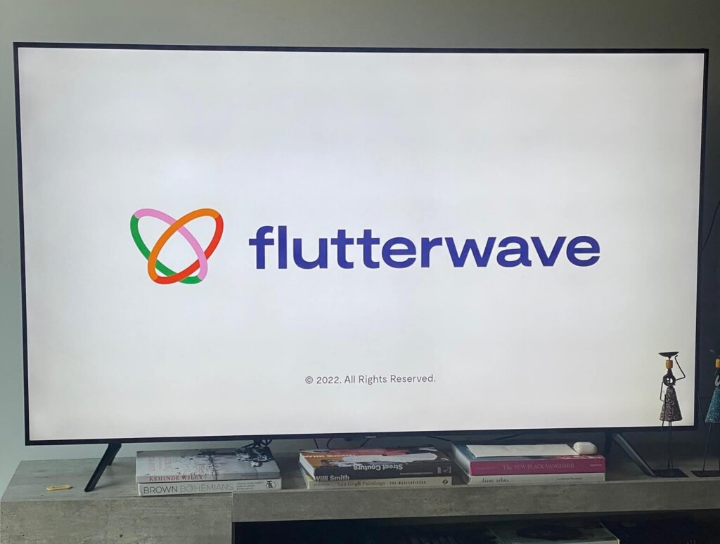
Let’s take a look at the new Flutterwave logo;

Flutterwave New Logo
Recall that Nigeria’s largest Telco, MTN, announced a revamp of their logo earlier this week, with their new logo looking all black in a minimalism-inspired design. Well, Flutterwave has taken a different approach by utilizing at least, 5 distinct colours.
A lot of people have expressed their own opinions on the new Flutterwave logo, however, here’s one remark by Dare Adu-Samuels that really stood out:
Butterfly. The movement of a butterfly in flight is called FLUTTER.
The first logo is the side view of a butterfly.
This new logo looks like the view from up.
I quite resonate with that, and since butterflies are typically colourful creatures, it also explains why the new logo has multiple colours. However, as of the time of writing this article, we are still yet to fully see how the new logo would be applied across all their brand assets.
Subscribe for updates

Maria wearing Flutterwave’s old logo at the recently concluded Big Brother Naija edition titled Lockdown
Is the beautiful yellow accent gone forever? We’d have to wait to find out.
User opinions on the new Flutterwave logo.
Since its founding in 2016 by Olugbenga Agboola, Flutterwave has managed to build an army of loyal users. This is the first time the brand would be undergoing a massive revamp in its 5-year history and here’s what users have to say about it:
Flutterwave rebrands their logo.
I am curious to know why they did that.The multicolor could mean varying service area or core values. The stem stroke has been ditched and the "W" is vivid. More like an inverted m of "Meta"
A font change too
What are your thoughts? pic.twitter.com/bEzaS4RwmT
— Greaterheights (@greaterheights_) February 19, 2022
I like Flutterwave’s new website but I LOVED the old one because Muster’s logo was on the landing page. Many of the product designers lived in ‘Musters’ at the time, I think. Most of FW folks in the Muster community now are developers.
To them I say: Sneak the logo back in guys!
— Ibraheem Babalola (@IBBabalola) February 19, 2022
That flutterwave new logo no enter Sha .
But I love the animation— Samuel Idowu (@designbyxam) February 18, 2022
I like the new Flutterwave logo
Omo it looks so good— Heritage (@alienjooce) February 18, 2022
Flutterwave's new logo 🤌💯
— Tegz (@tega_edeki) February 18, 2022
Conclusion
After reading hundreds of reactions and comments from Facebook and Twitter, the new Flutterwave logo seems to be enjoying a much warmer welcome in contrast to MTN’s new minimalistic logo.
I personally love Flutterwave’s old logo, but what are your own thoughts? Please comment below 😃.


