The world wide web is about first impressions and about keeping visitors on your website for as long as possible. Anyone who clicks away immediately because something does not suit them is lost as a customer. A good website concept helps to retain visitors and develop them into customers.
No second chance for a good first impression
How does your website receive visitors? How quickly can they find their way around? How logically are the paths your web visitors take? Can they find what they are looking for? Are they encouraged to leave their contact details? Well, just a few details that are essential for a website concept – whether for a website relaunch or for a new website.
The building blocks for a good website
Many elements can be found on virtually every website and can therefore be viewed as the building blocks of websites.
- A look or a design: is one of the elements that most quickly decide whether visitors stay or leave again. Should represent your company ideally and be as independent as possible.
- Content: Texts (including keywords), images, videos that meet the information needs of your visitors. Content not only conveys your company, your offers and products, but can also provide the visitor with further information.
- Contact options: The range goes from a simple contact page to customized call-to-actions. It is important that the establishment of contact appears natural and is made easy.
- Measures for visitor loyalty: Goodies that you give out in exchange for an e-mail address can bind visitors to your website. For example in the form of a newsletter or an e-book.
- Elements that distinguish you from your competitors: Whatever that may be, at least give it a lot of thought. Clever stand-alone positions can make a huge difference. Even if you are copied sooner or later, the market knows that you were the pioneer.
Your target group determines the choice of content
What belongs on your website usually results automatically when you consider your target group (a.k.a Target Audience) and your offer. You design the website for this target group. Incidentally, this is much easier if you visualize a certain person in the target group as concretely as possible and then imagine in the future to design a website for precisely this person. (Depending on the target group, this can also be several people.)
Write down all that you think the target person would love to see on the website and give each item a priority as it corresponds to their importance. The order affects which element is best placed where. This practice is known as Information Hierarchy.
But also keep in mind that you normally do not know which page of the website is used to access the website. The homepage is not always the first page they would visit, especially when your website is visited from search engine result pages. The website conception must take this into account and must not ensure that all pages are of good quality.
The sitemap and navigation
A sitemap is a plan for how the various content on your website is organized. Regardless of which subpage the visitor enters from and what their interests are, he must be able to move safely through the website by using the navigation menu.
The navigation menu serves as a visible navigation tool through the page structure of a website.
The important links should be more obvious than the less important ones. That is why we have Menus and Submenus.
At the same time, a good page structure must also encourage discovery and must always entice visitors to the next click. Website visitors are reluctant to be squeezed into a rigid framework, they want to move freely and discover interesting things over and over again.
From overview to detail
For the organization of your information, you should start from different information needs, which correspond to a level of depth on the website. (Depth refers to the number of clicks that are required to get to certain information n your website.)
Your start page or homepage only transports the central messages and serves as an interface to deeper information levels.
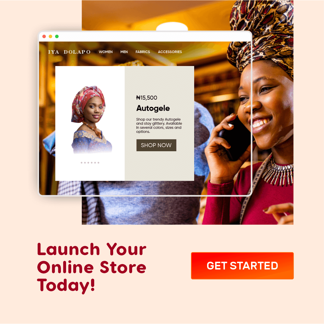
An example: The main benefit of your services or products is briefly presented on the homepage. From there you can get more detailed descriptions and additional details via links or CTA (or Call to action) buttons.
Another level, for example, can be very fundamentally concerned with the use of your services. This can be done, for example, through background articles that are summarized in the form of a blog. For a better overview, topics can be put together again in a clear manner.
These levels make it possible to address the various information needs of potential customers. Over time, these develop from very general interest to a need for knowledge about the details of your specific offers.
Subscribe for updates
Good web design follows function
The job of web design is not just to be visually creative. Web design can also look good, but above all, it should be clear and unambiguous. Standards that everyone has gotten used to should only be given up if you have a concrete reason for doing so.
For example, a logo is always at the top left corner; that’s where visitors expect it. If you link the logo on every page in such a way that clicking on the logo takes visitors to the home page, that is another standard that people expect.
If your company has a slogan, a motto or a claim, this message ideally belongs near the logo.
The menu is also best located at the top, simply because it is known from most websites and works well.
Please do not get creative when naming menu items, but think with the visitor’s head which names of the menu items they need in order to find their way around.
A multi-column layout can help structure content more clearly. However, it must then be clear which column transports the central content and which only has a supplementary function.
It is important that a good web design can flow freely with the content and does not restrict you too much. For example, if web design is not flexible in terms of the amount of text, then it is usually not a good web design.
You shouldn’t just use pictures “because that’s how you do it”. Instead, images should support and complement the statements on your website. In addition, images enable emotionalisation and, through skilful selection, can greatly contribute to the uniqueness of a company image.
Pay more attention to legal requirements
Legislators also have some requirements for your website. It is therefore mandatory that you have imprint and data protection information on the site.

Cookie Consent Prompt
If you collect user data, either directly or through third-party technologies such as Mailchimp, Google Analytics, e.t.c., you are required by law to obtain the consent of your users via a popup or dismissable notice on your website. You would also need a Cookie Policy or/and Privacy Policy page(s) to explain how you use or process user data.
These pages should be visible and directly accessible via an easy-to-find link on the every page. This act is regulated by federal data protection laws such as the CCPC, GDPR etc.
What applies to your website depends on your region and that of the users of your website, but a GDPR compliance is sufficient in most cases.
If the subject of user data collection is too dry for you, you can consult with a contemporary lawyer or read about the fundamentals.
Establishing contacts is mandatory
Potential customers who visit your website once and never find their way back are of no use to you. You should therefore aim to retain these visitors so that you can send them information later. This is where blog comments and newsletters come in, but having a contact page can also do wonders since users would need to submit their emails to contact you.
Interaction elements, also known as call-to-action, are therefore so important for successful websites.
In addition, think about including your phone number and email address on every page, for example in the header or footer of the website. This allows your website visitors to quickly get in touch with you.

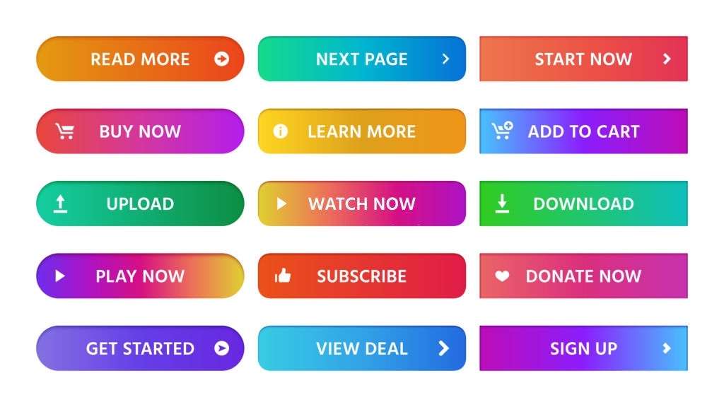
Bunch of CTA buttons
A contextual call-to-action, which actively prompts the visitor to take any action at a strategically appropriate point in the content, works best. If there’s a small reward in return for that action, a call-to-action works even better.
For example, you can exchange an e-book for the e-mail address of your visitors and thus have the chance to prove your competence in the long term via a newsletter.
I hope you enjoyed reading. Please share.


